The Pro Component Approach to FlutterFlow Development
Author:

Gokul Shivappa
Reading Time: 15 minutes
Introduction
Building apps in FlutterFlow gets messy fast. Text fields, buttons, and cards copied across screens. One design change means updating 20+ instances manually.
The solution? Components. Build once, reuse everywhere, update in one place.
Table of Contents
Why Components Matter
Creating a Reusable Component
Adding Parameters for Flexibility
Organizing with a Shared Folder
Real Example: Login and Signup
Naming Conventions
When to Create a Component
Best Practices
Watch the Full Process
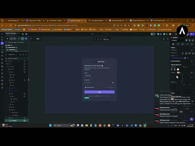
This tutorial is based on a clip from my Custom Chat App live stream series. In the video, I demonstrate this entire workflow while building a chat app—but the process works for any FlutterFlow project.
Why Components Matter
Components eliminate repetitive work. Build once, reuse everywhere.
Consider a text field used across login, signup, profile edit, and settings-that's 4+ instances with identical styling. When your client requests rounded corners instead of square, components let you update once instead of editing each instance manually.
Without components: Manual updates across multiple screens With components: One change propagates everywhere
Creating a Reusable Component
Let's build an input field component:
Design your text field with complete styling (border, colors, padding)
Right-click and select "Convert to Component"
Name it using snake_case (e.g.,
input_field)Move it to a "shared" folder for organization
Adding Parameters for Flexibility
Static components are limiting. Parameters enable the same input field to work for email, password, username, and more.
Essential parameters for an input field:
title (String) – Label above the field
hintText (String) - Placeholder text
initialText (String) – Pre-filled value for edit screens
Note: FlutterFlow requires PascalCase for parameter names, not snake_case.
Dynamic usage example:
Email field:
title = "Email",hintText = "Enter your email"Password field:
title = "Password",hintText = "Enter your password"Username field:
title = "Username",hintText = "Choose a username"
Organizing with a Shared Folder
Create a shared folder in your components directory. This keeps your project clean and components easily discoverable.
Recommended structure:
Real Example: Login and Signup
Scenario: Login needs email and password fields. Signup needs username, email, and password fields.
Without components: Build and style 5 separate text fields With components: Build 1 input field component, reuse 5 times with different parameters
Pro tip: Use a page state (isSignUp boolean) to toggle between login and signup UI on the same page using identical components.
Naming Conventions
Consistency improves maintainability:
Pages, folders, data types: snake_case (
login_page,user_profile)Component parameters: PascalCase (
hintText,initialText)Widget tags: Descriptive names (
login_email,signup_password)
Widget tags simplify backend integration by making field identification straightforward.
When to Create a Component
Ask: "Will I use this more than once?"
If yes, componentize it.
Common component candidates:
Input fields and buttons (primary, secondary, social)
Cards (product, user, list items)
Headers and footers
Bottom navigation bars
Empty states and loading indicators
Best Practices
Avoid over-componentization - Keep truly unique elements as widgets
Start simple - Add parameters only when needed
Duplicate strategically - Need a password field with visibility toggle? Duplicate your
input_fieldcomponent and modifyMinimize parameters - Too many parameters create complexity
Key Takeaway
The component approach saves hours of work. Build once, reuse everywhere, update in one place.
Next time you copy-paste a widget, ask: Should this be a component?


